For My Love of Fried Chicken
Tim is a design and product executive who leads high-performing teams to deliver results beyond expectations–across startups, multinationals, nonprofits, and Fortune 500s. From brand to product to platform.
And he believe a Friday sharing chicken tenders with colleagues builds a strong team culture.
On the forefront of fast food
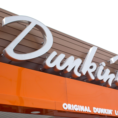
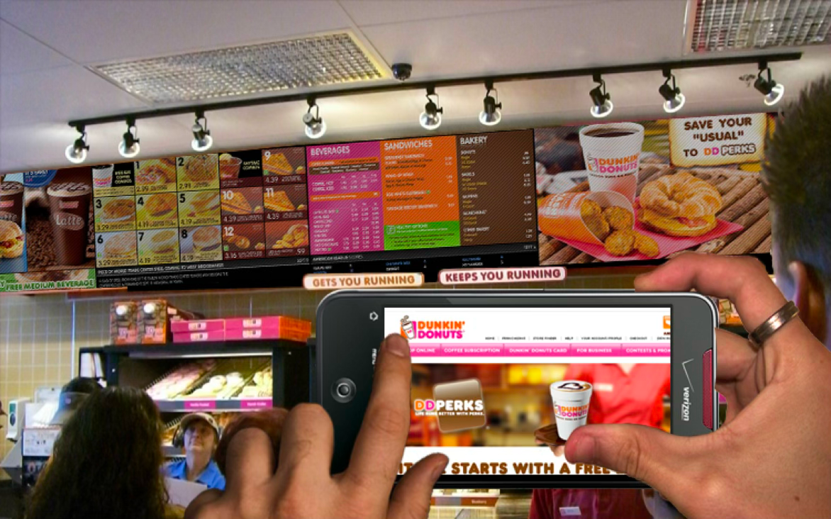
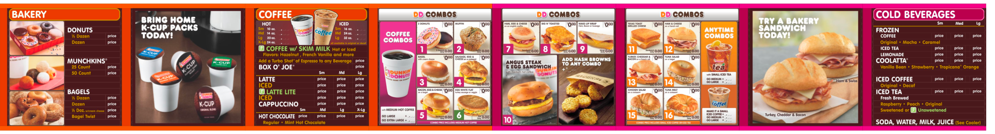
America Runs on Dunkin’. And in 2010, the brand’s in-store experience ran on cardboard, magnets, and double-sided tape. Much like most of its competitors.
The brand’s franchise model had led to inconsistent brand experiences from store to store and still hadn’t expanded to the West Coast.
Over the next three+ years, I led strategy, design, and research for the brand’s digital menuboard initiative–from a small pilot to the global standard.
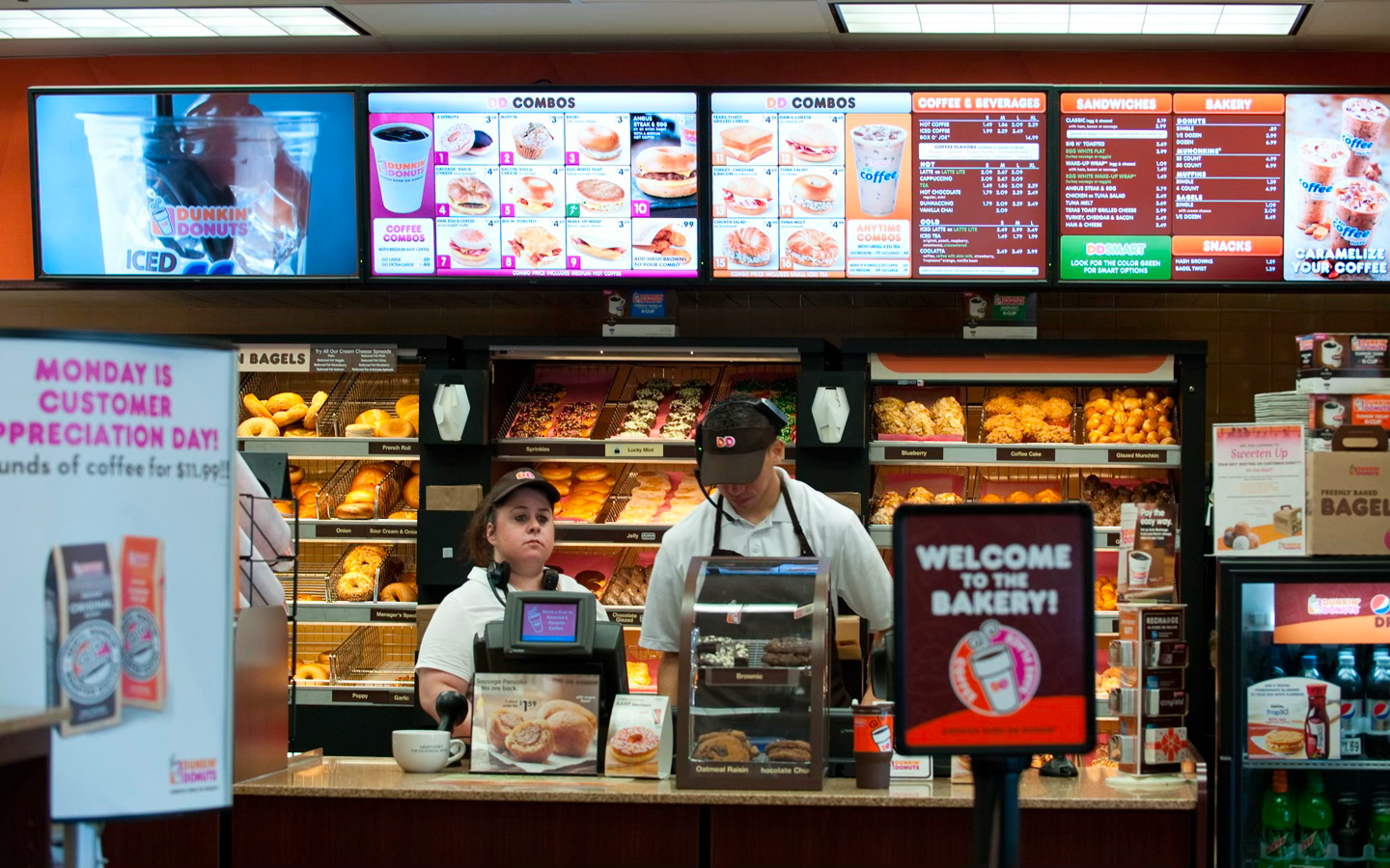
Pilot Site Installation. Brockton, MA
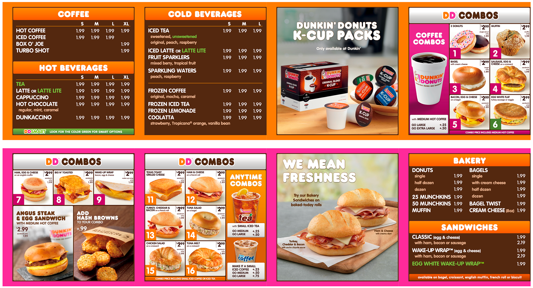
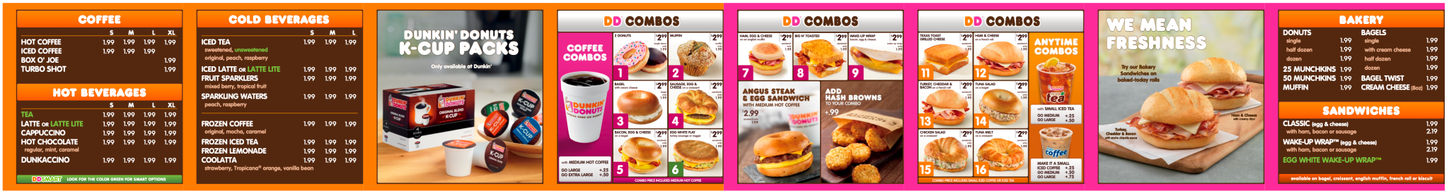
Original Concepts. While leveraging existing assets we shared a bold perspective of what the new menu experience would become.
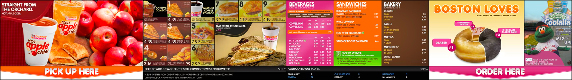
Original Concepts. Dynamic multimedia and promotions guided guests as they waited to order or pick up.
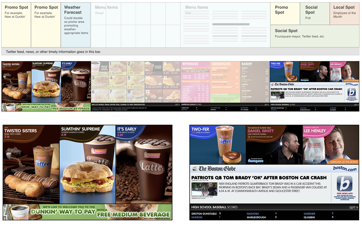
Original Concepts. From simple boxes into a rich multimedia menu experience.
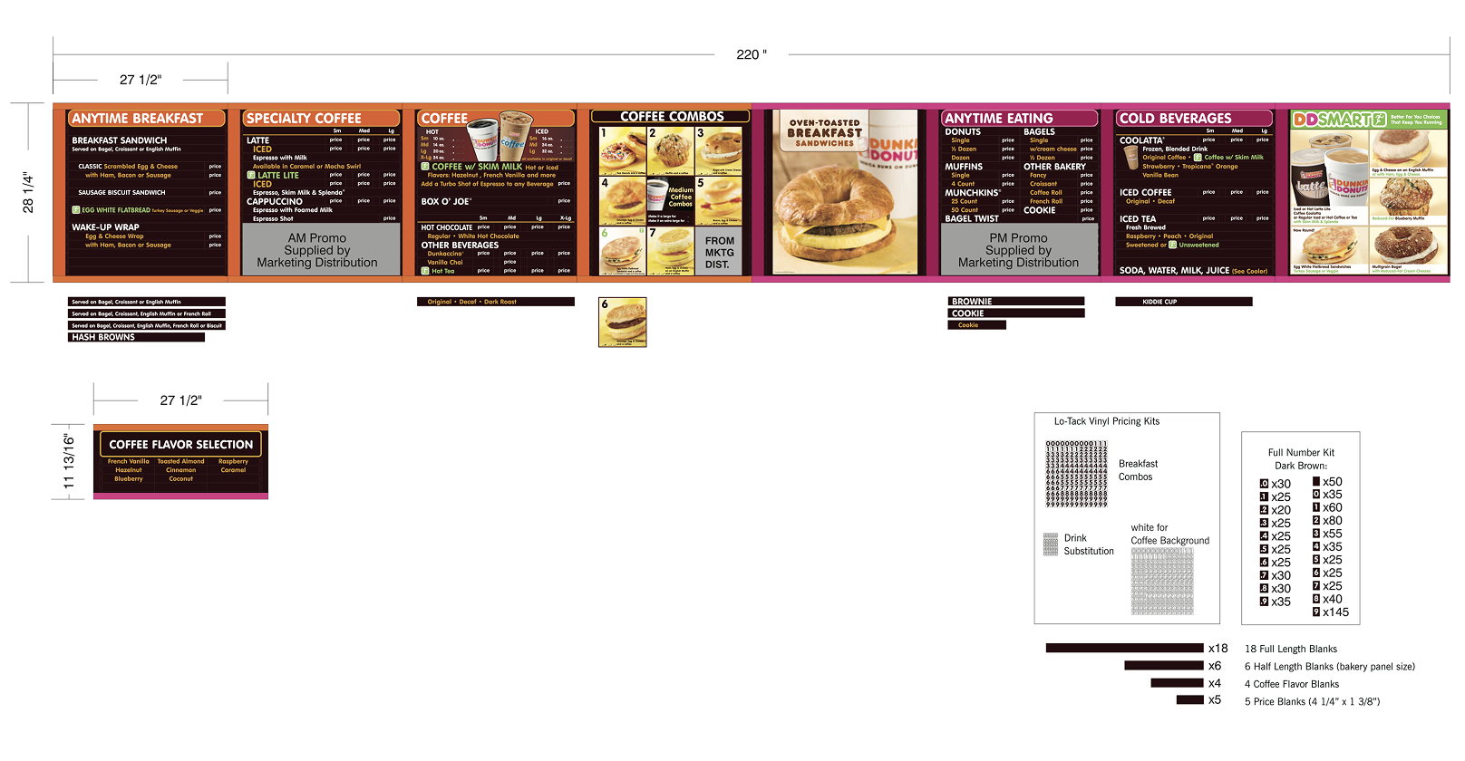
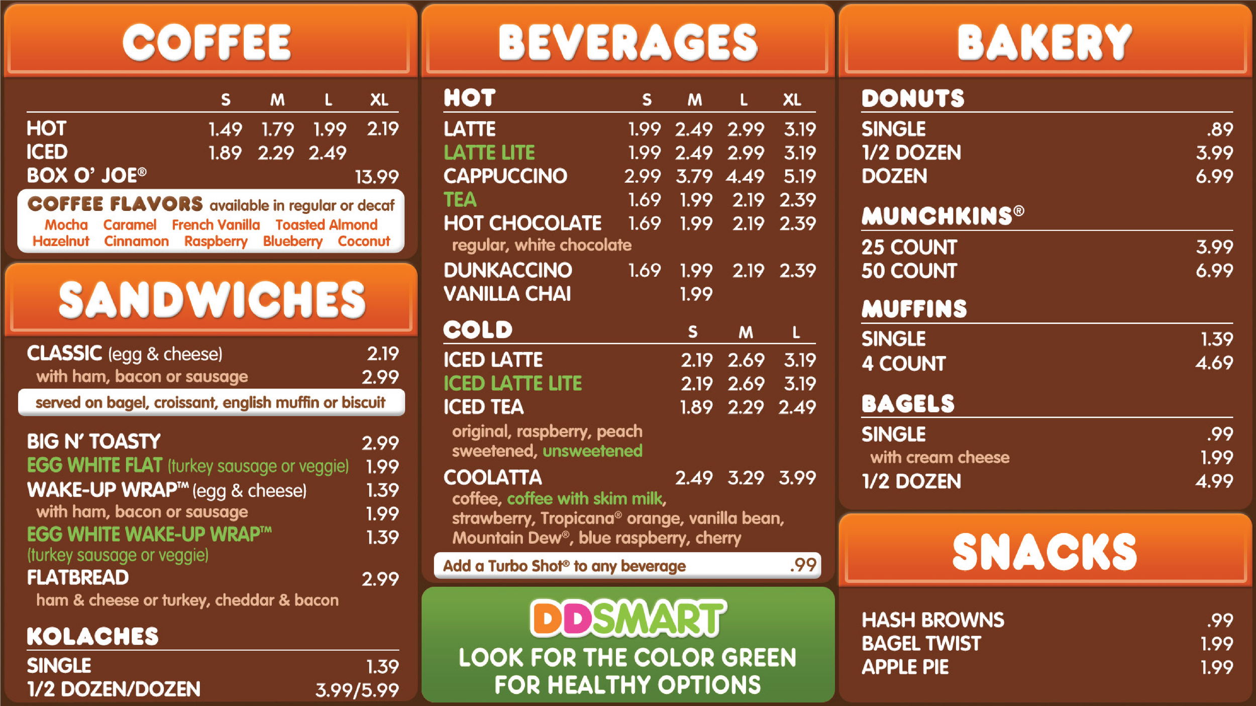
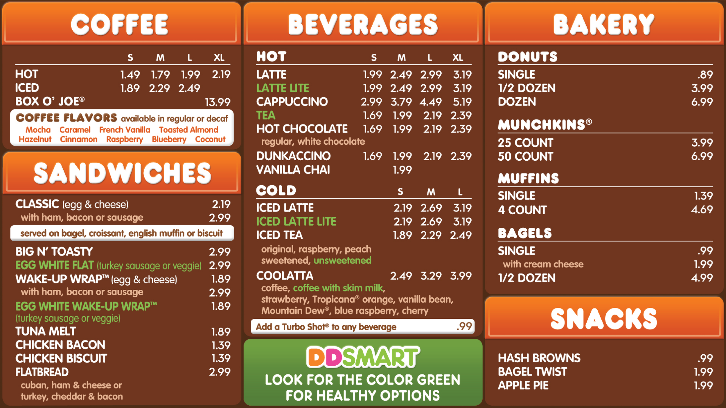
Static Menuboard Variation. Circa 2010-2011
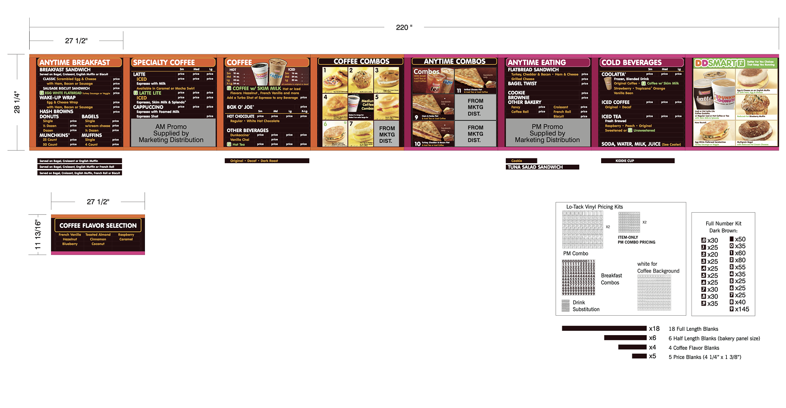
Static Menuboard Variation. Circa 2010-2011
Static Menuboard Variation. Circa 2010-2011
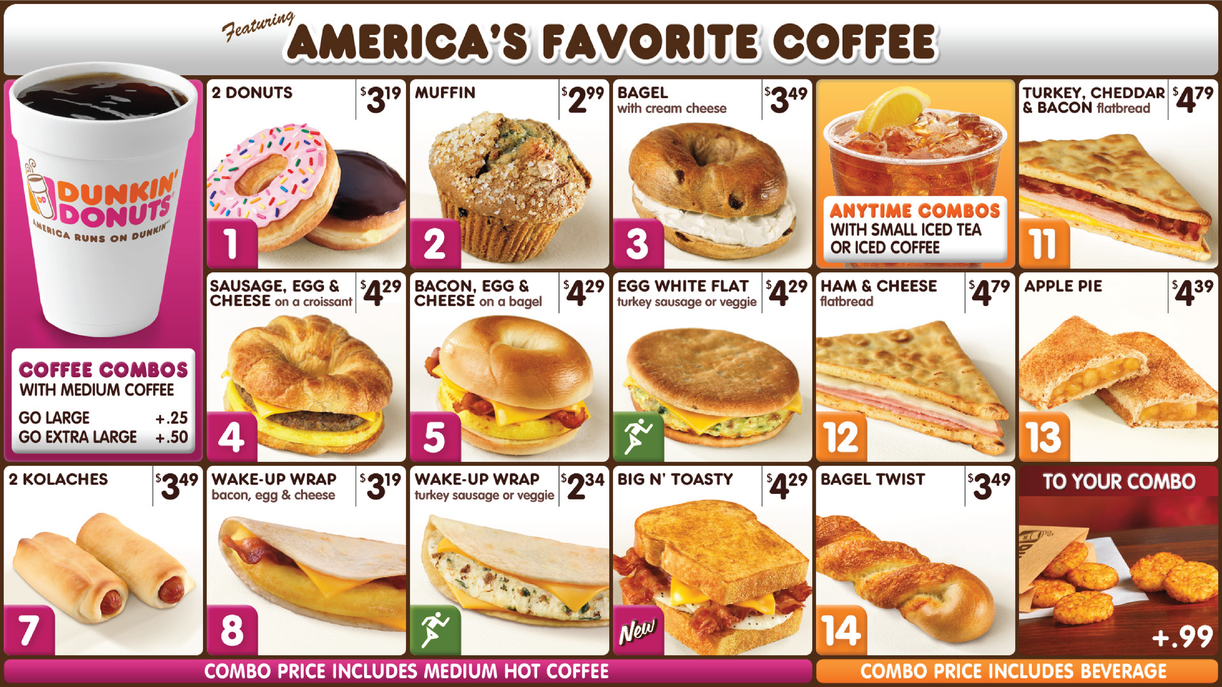
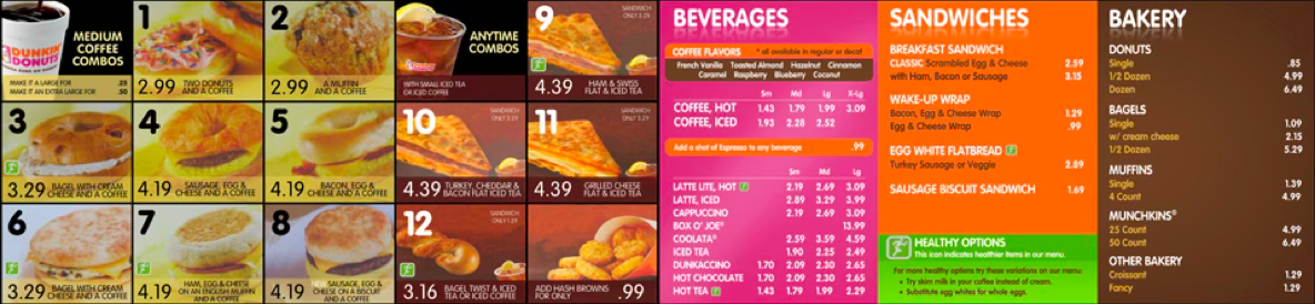
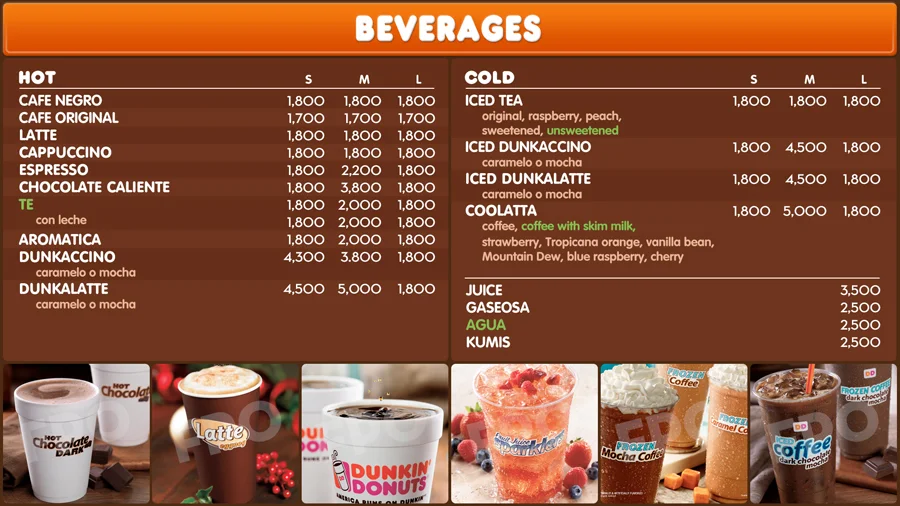
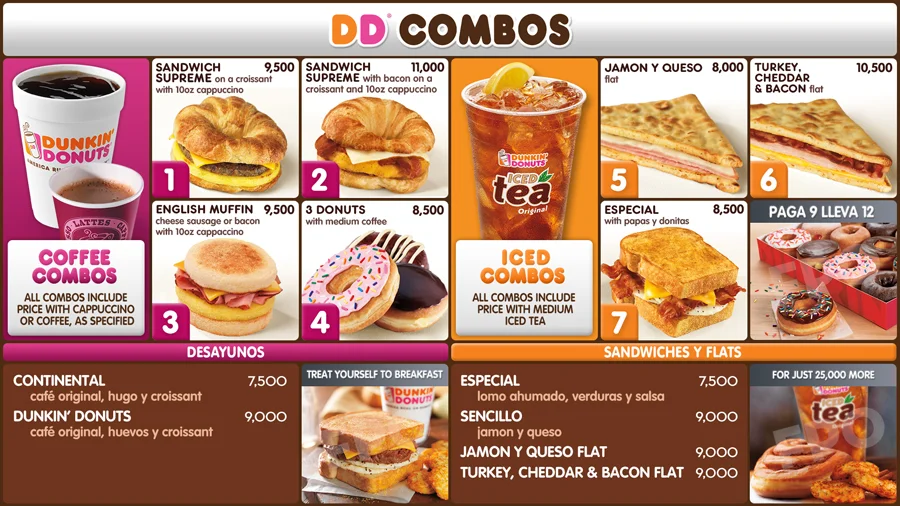
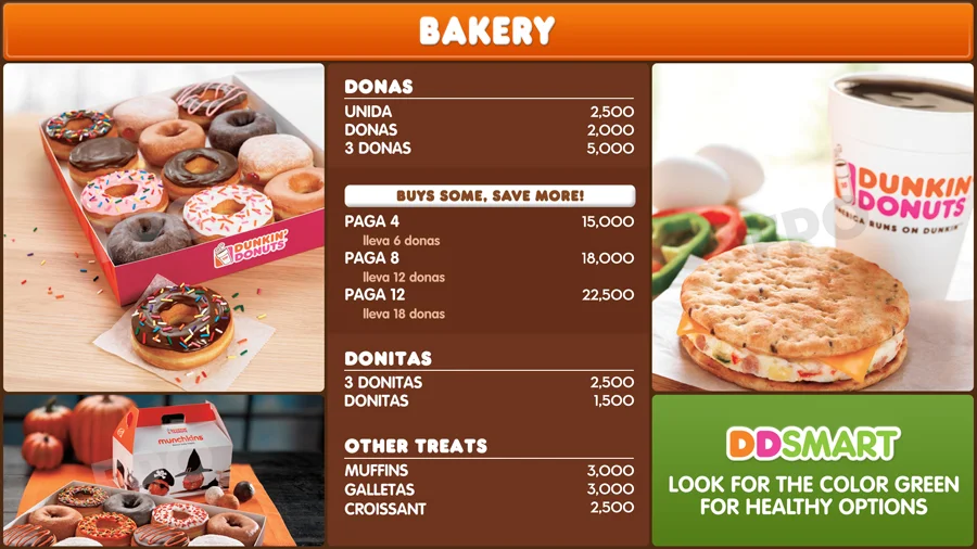
Pilot Creative. We displayed combos on white background to improve visibility and appeal. Microanimations allowed for brand expression.
Pilot Creative. Southeast Region. Local offerings, like the Kolache allow franchisees controlled customization.
Pilot Creative. Miami Region. Limited Time Offerings and test products like the Chicken Sandwiches added easily.
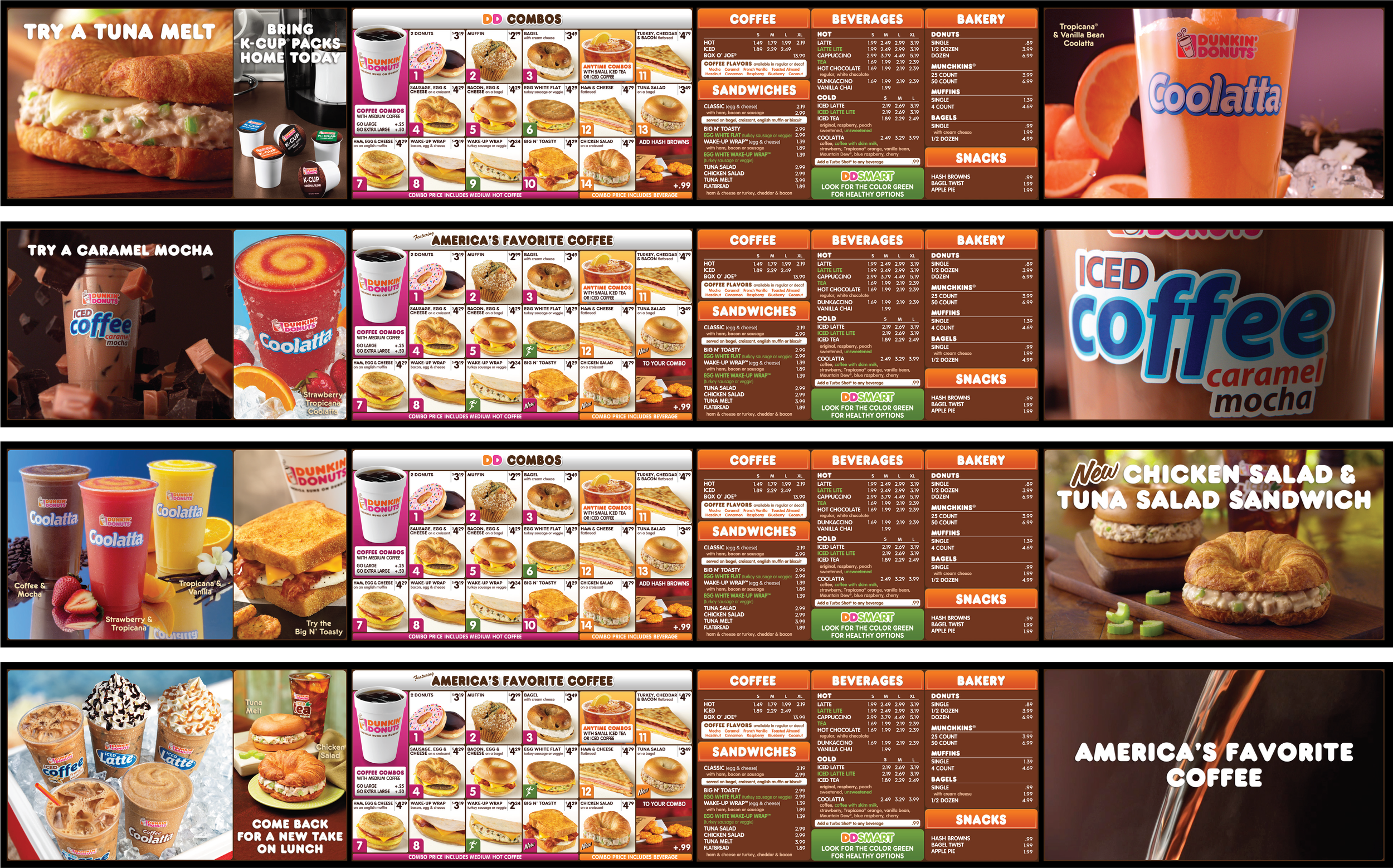
Pilot Creative. Northeast Region. Multimedia asset were developed with consideration for dwell time.
Original Concepts. Bridging the store and digital experiences via QR codes in 2010.
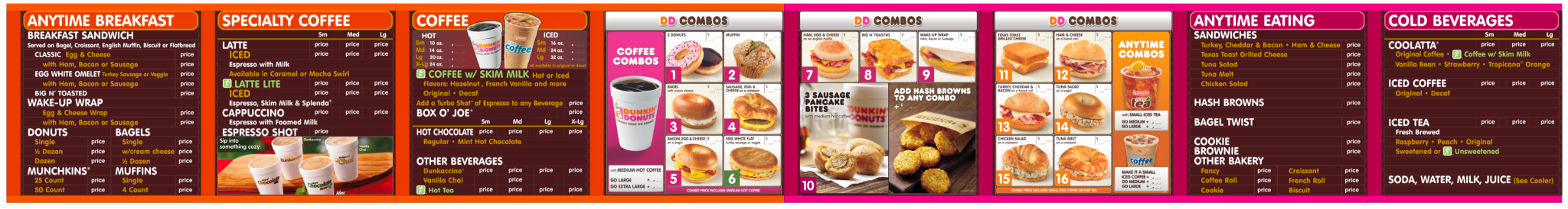
Phase 2 Creative. Bogota, Columbia
Phase 2 Creative. Bogota, Columbia
Phase 2 Creative. Bogota, Columbia
Great design is measurable — and the minimum is 3% better than the alternative.
Dunkin’ provided us a key research project when it asked us to return to cardboard and magnetics again.
Even after one year of the pilot, some franchisees remained skeptical of the costs of digital menu boards and challenged us to apply our design principles to the static executions.
Challenge accepted…
Test Creative. Detailed view
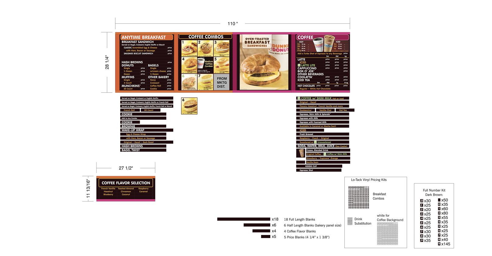
Test Creative. This version utilized spacing, architecture, and typography from digital.
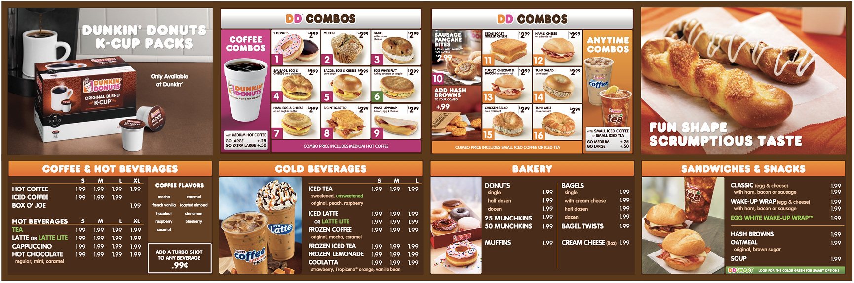
Static Menu. Longboard Format.
Circa 2012. Static version post Combo section optimizations.
Circa 2012.
Additional Dunkin Initiatives
-
![]()
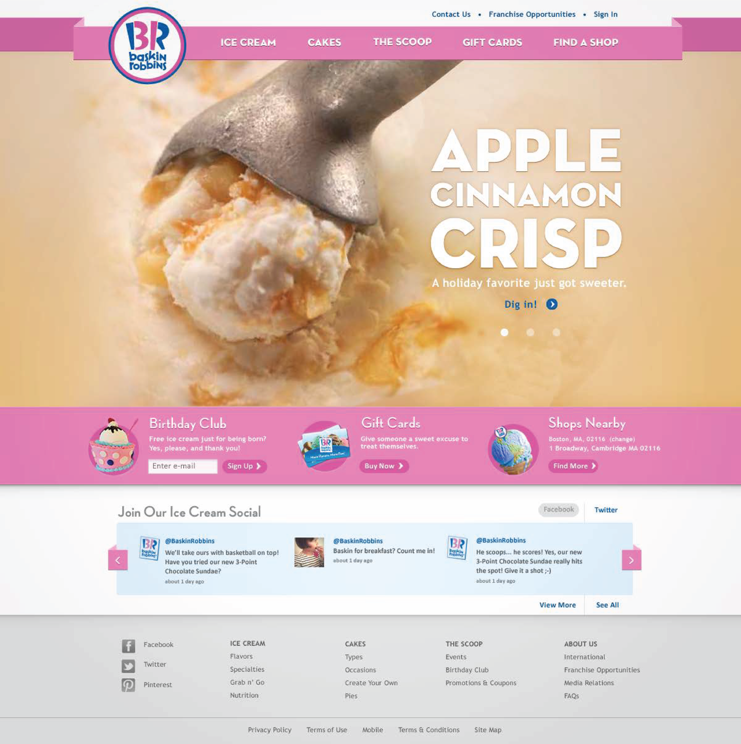
Baskin Robbins
with a weak digital experience and outdated platforms, BR partnered with us to modernize their site and help bring cake ordering online.
-
![]()
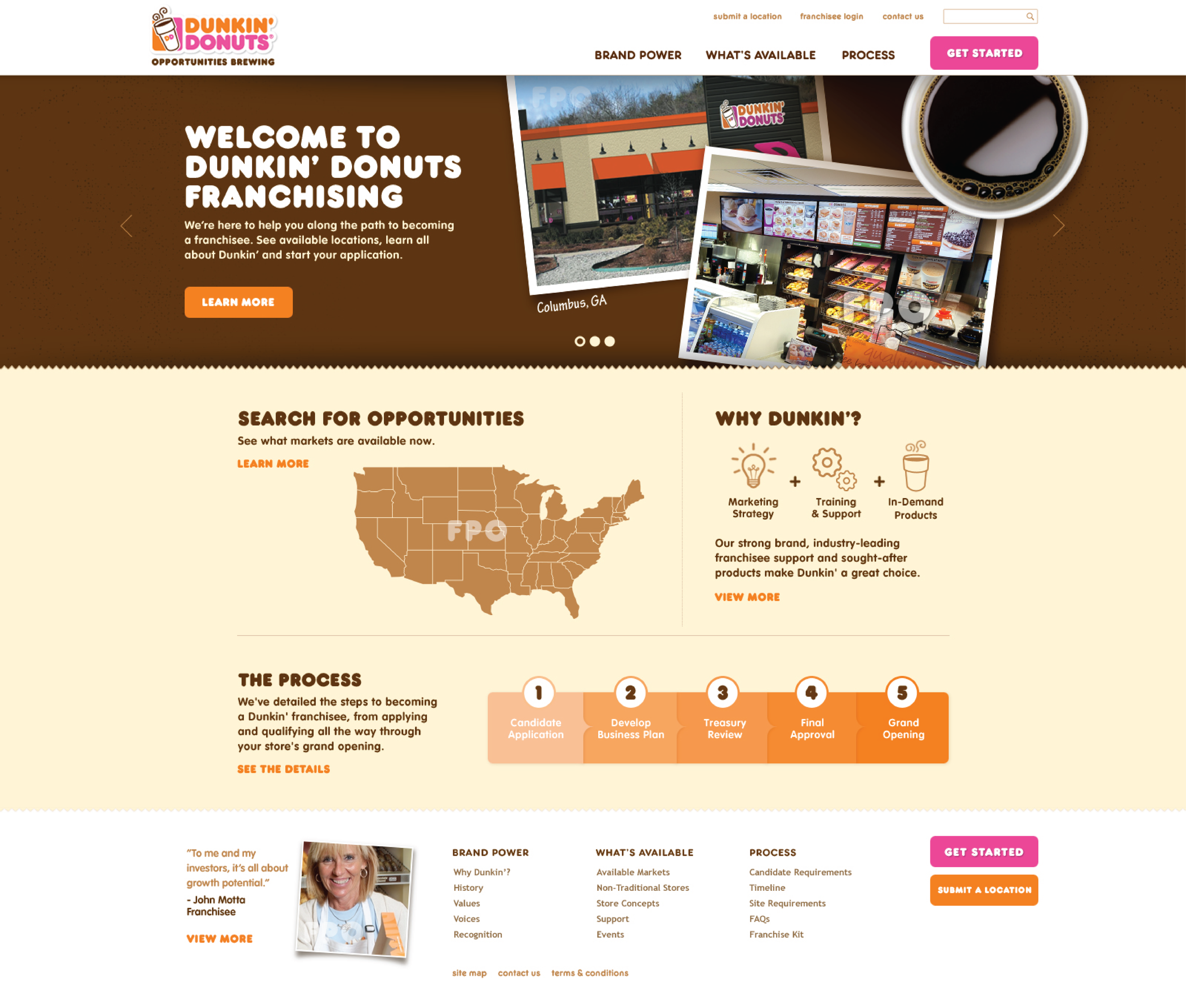
Dunkin' Brands
With national expansion on the horizon, Dunkin partnered with us to redesign/replatform their B2B web presence for acquisition and operations.
From startup culture to enterprise-grade design capability
After 15 years in agencies, I joined as Head of Product Design to modernize WordStream’s product and build the design practice.
I leed redesign of core ad optimization workflows, launched the company's first design system aligned to React component libraries, and introduced Figma + FullStory across the organization. Built the cross-functional research and insight infrastructure that informed product, marketing, sales, and executive decision-making.
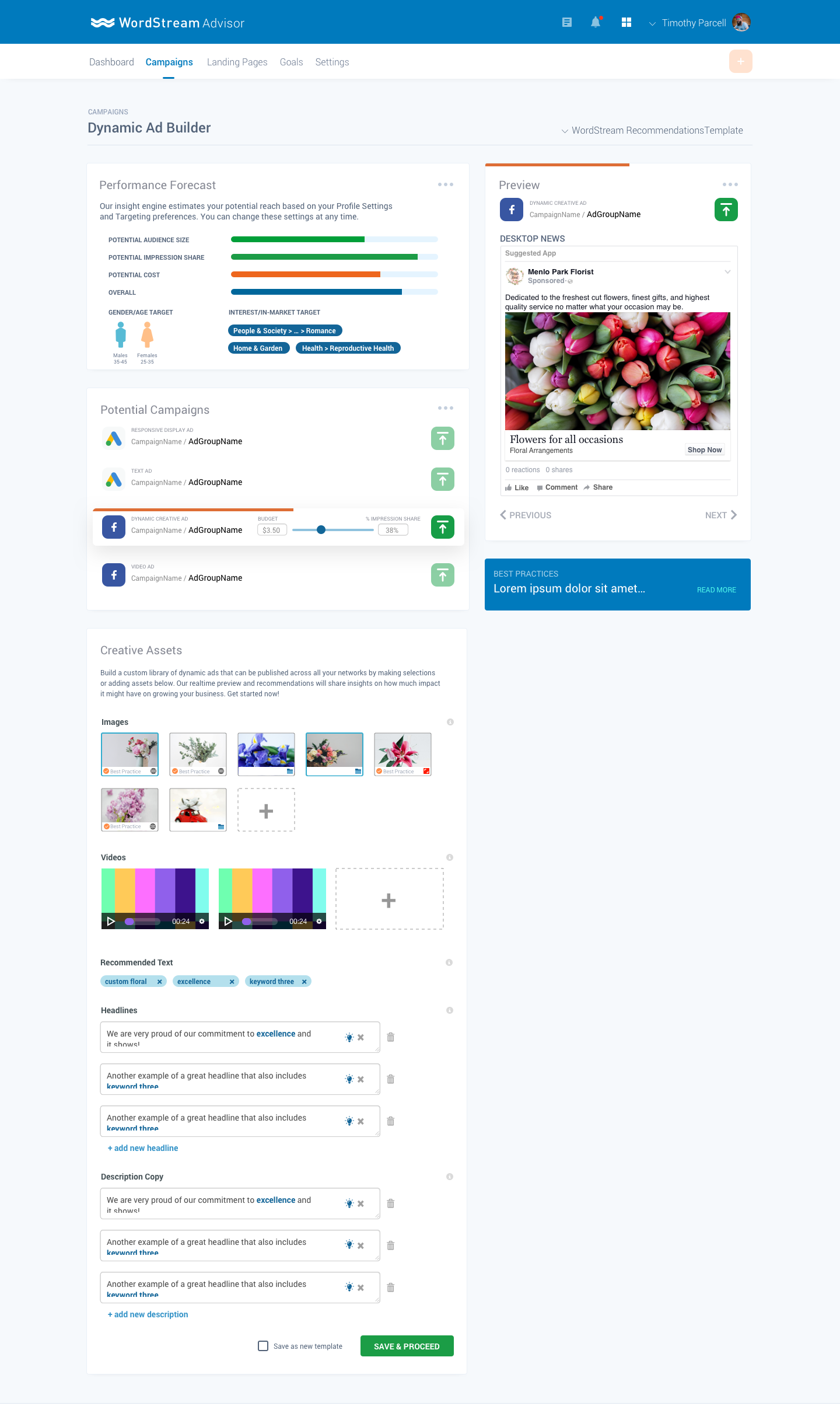
Landing Page Builder Demo
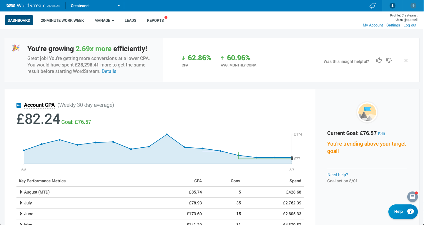
Wordstream Dashboard.
![Wordsream Revenue Optimizer [Beta Release]](https://images.squarespace-cdn.com/content/v1/5b3b4a58cef372fc782273d0/67086b53-3147-4435-9258-a529c515d422/New+Traiining+module.png)
Wordsream Revenue Optimizer [Beta Release]
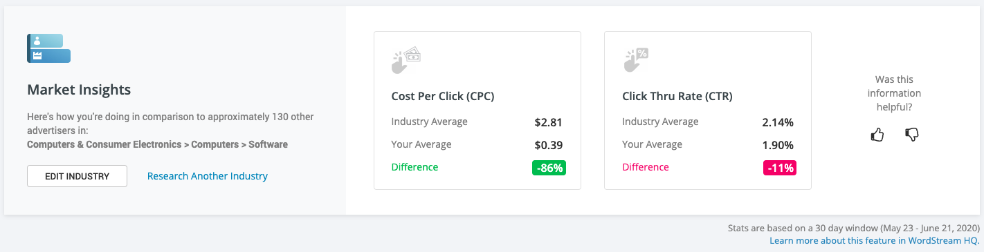
WordStream Market Insights. An early test of personalized capabilities. AI recommendations were being tested against our in-house SEM experts.
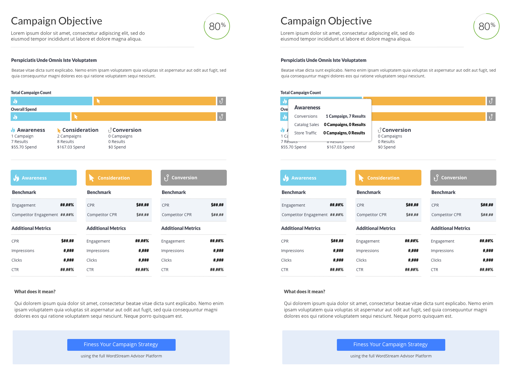
WordStream. Early exploration of new model leading with objectives first.
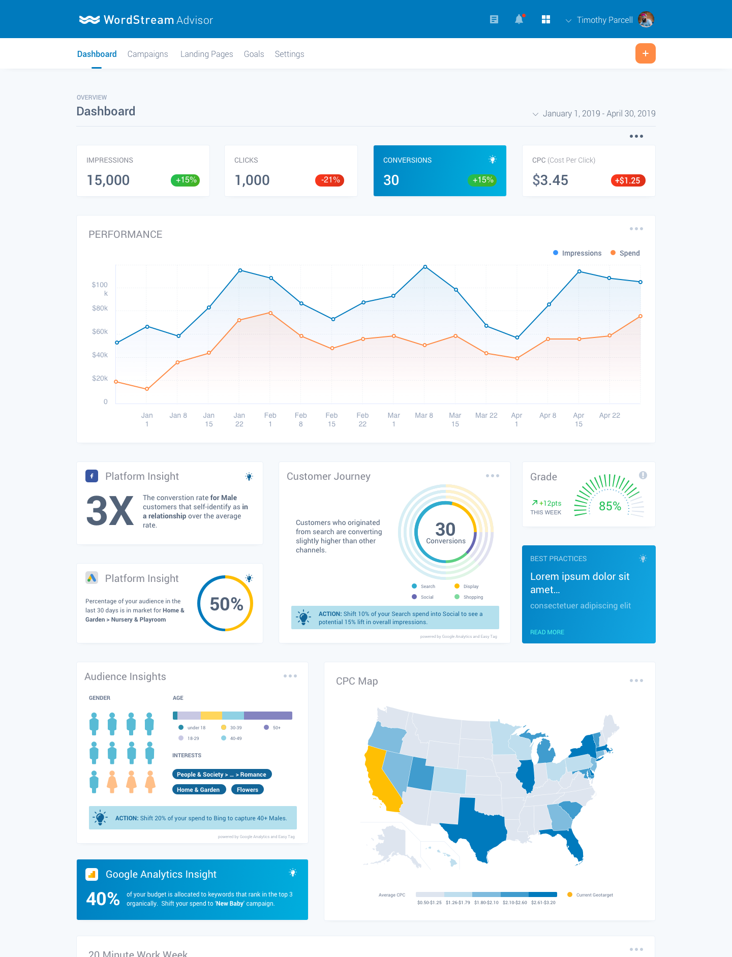
WordStream "Moonshot". A complete reimagining of the main experience to provide richer data visualization and engagement.
Wordsream "Moonshot". An early stage exploration that later became part of Conversion Toolkit.
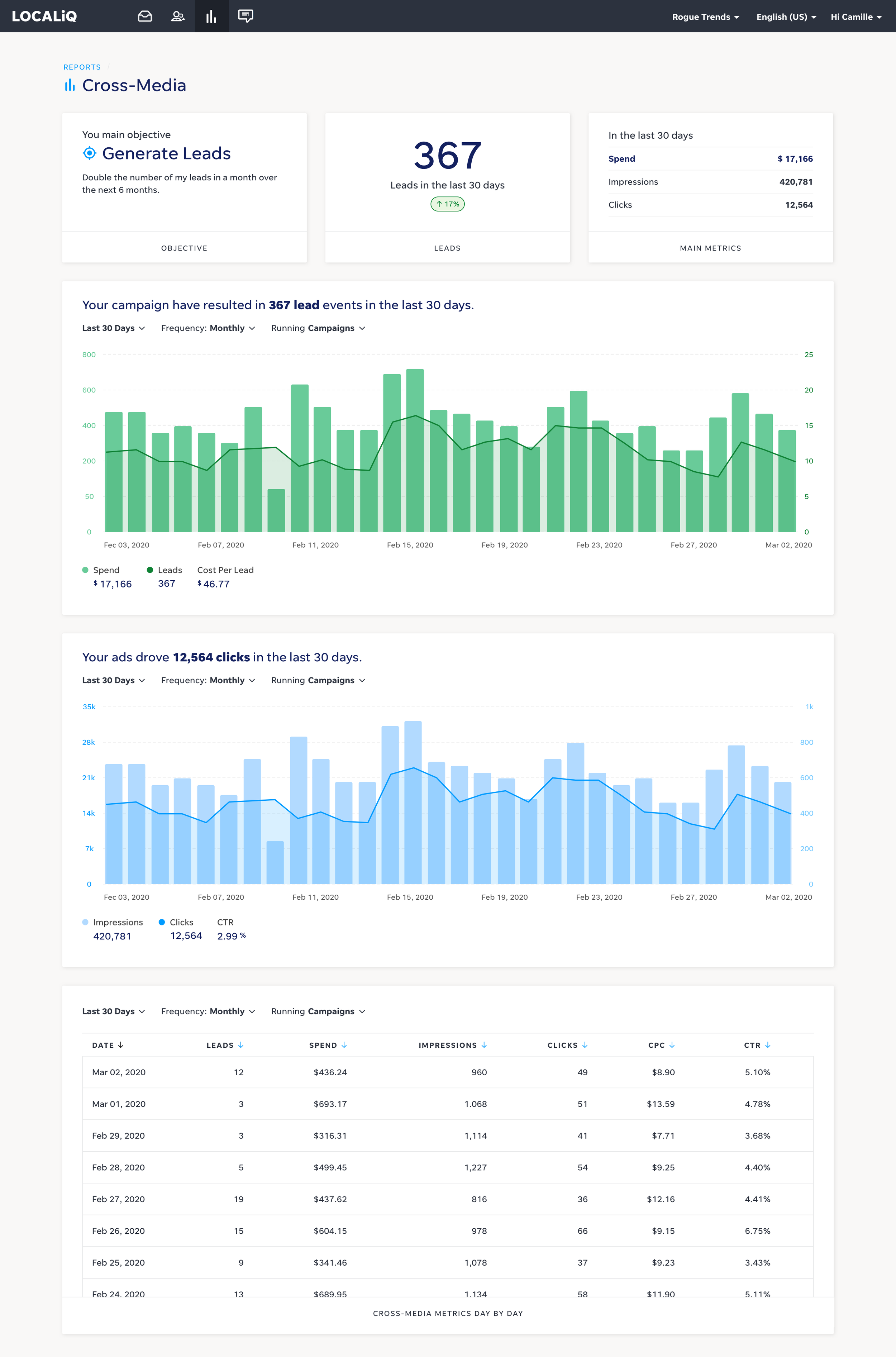
LocalIQ Cross Media Dashboard.
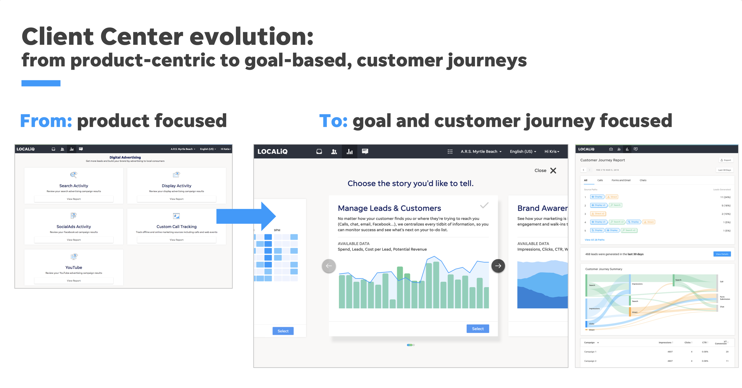
LocalIQ Experience Strategy.
Leading design at scale and crafting a vision for the Education Solutions company.
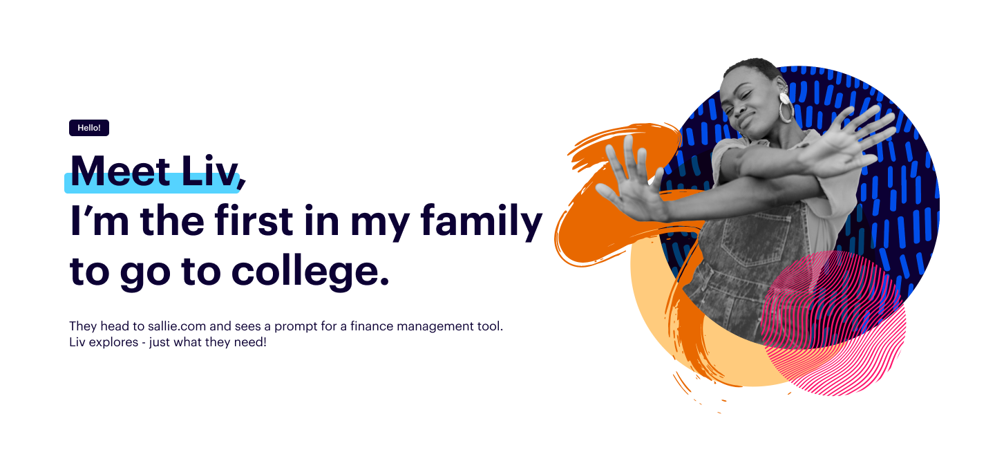
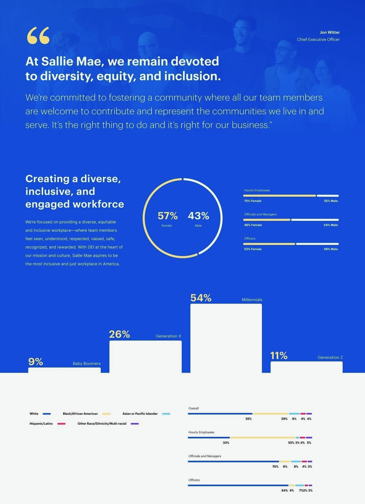
America’s largest private student lender. High-stakes decisions. Complex Regulatory environment.
I led design strategy and execution for all digital products and experiences at Sallie Mae–from marketing through final loan payoff. I set a new standard for design then we made it a system. Products after infrastructure.
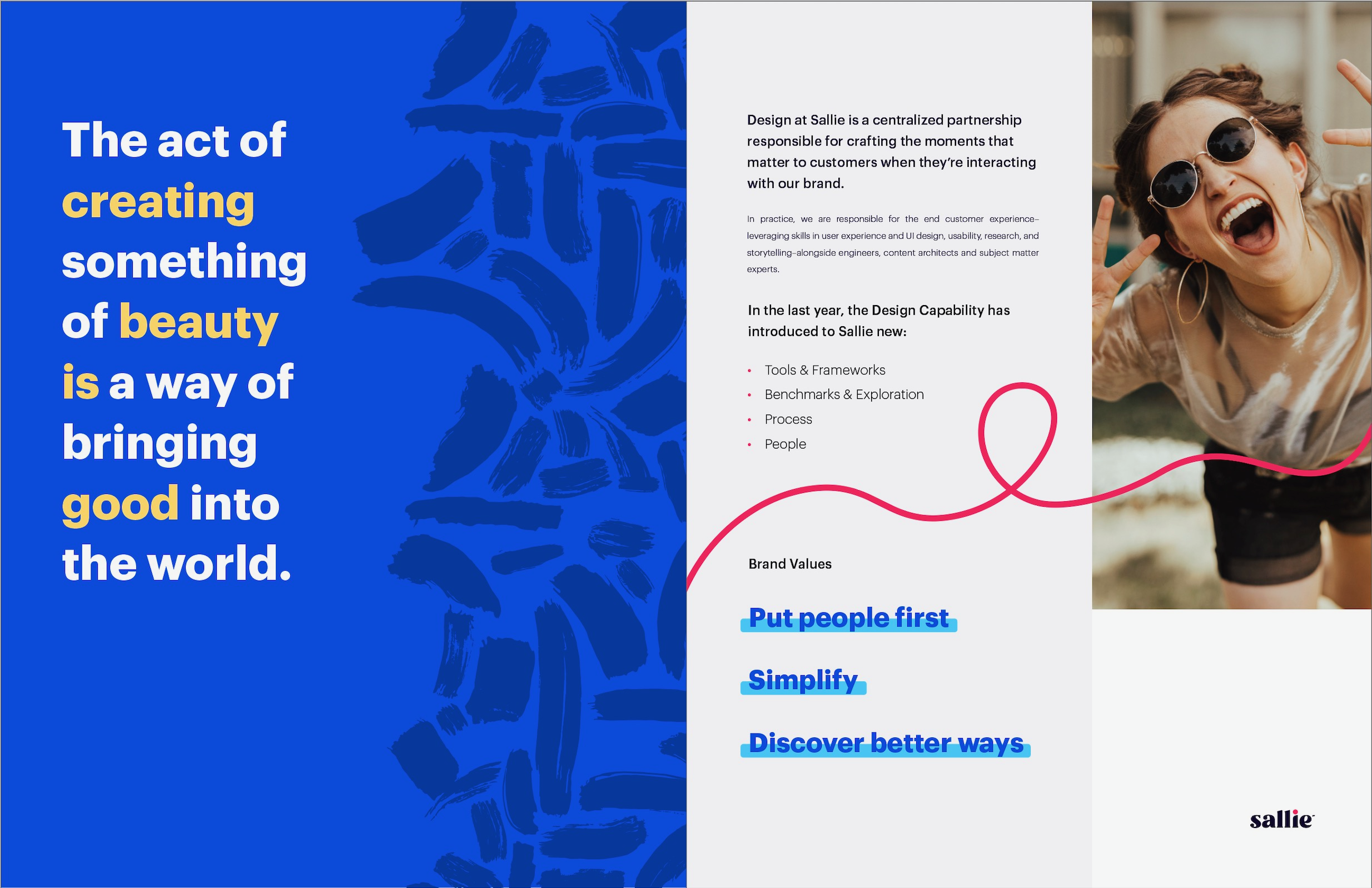
Design at Sallie. Who we are and what we do.
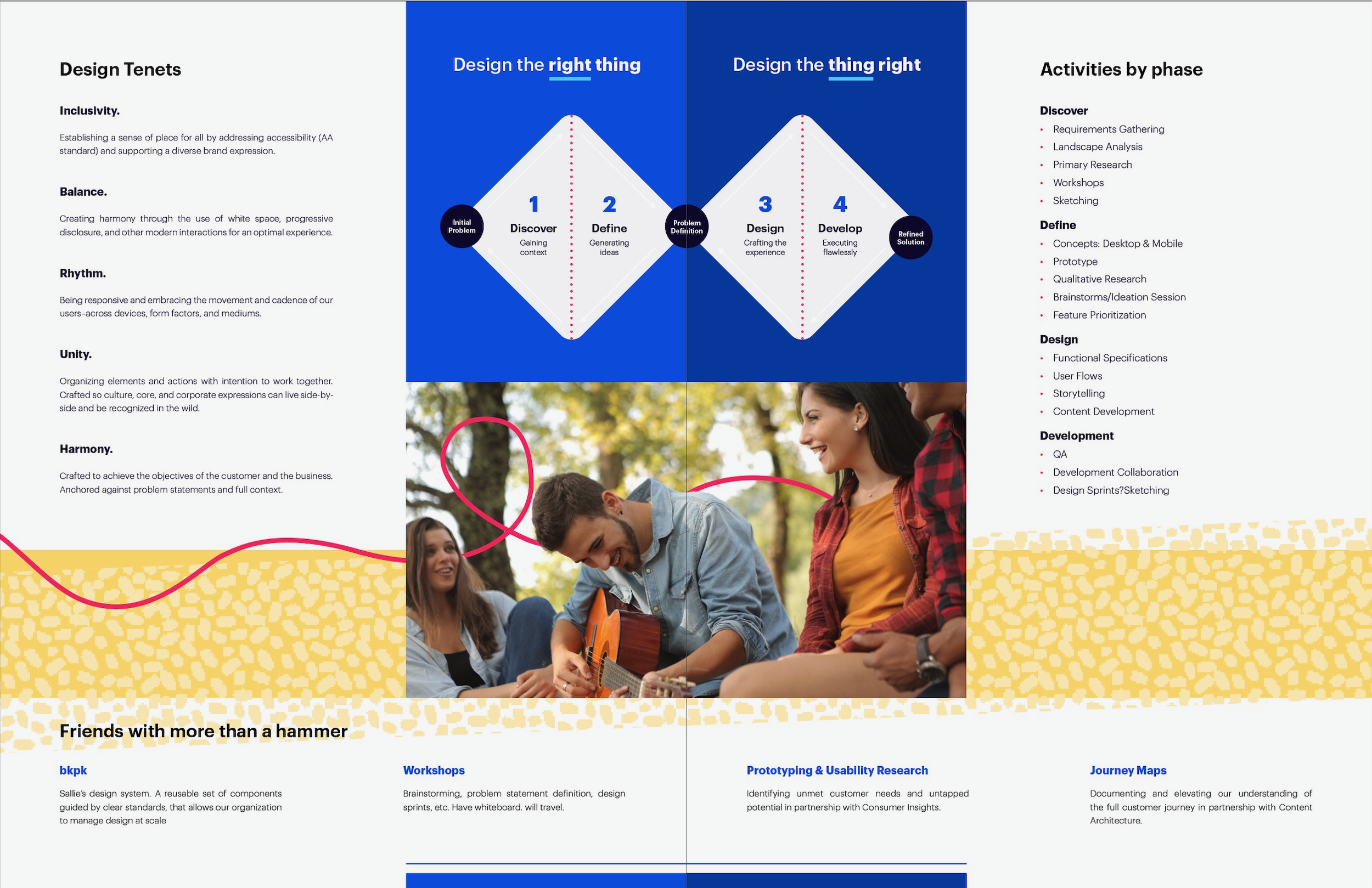
Design at Sallie. How we think and how we collaborate.
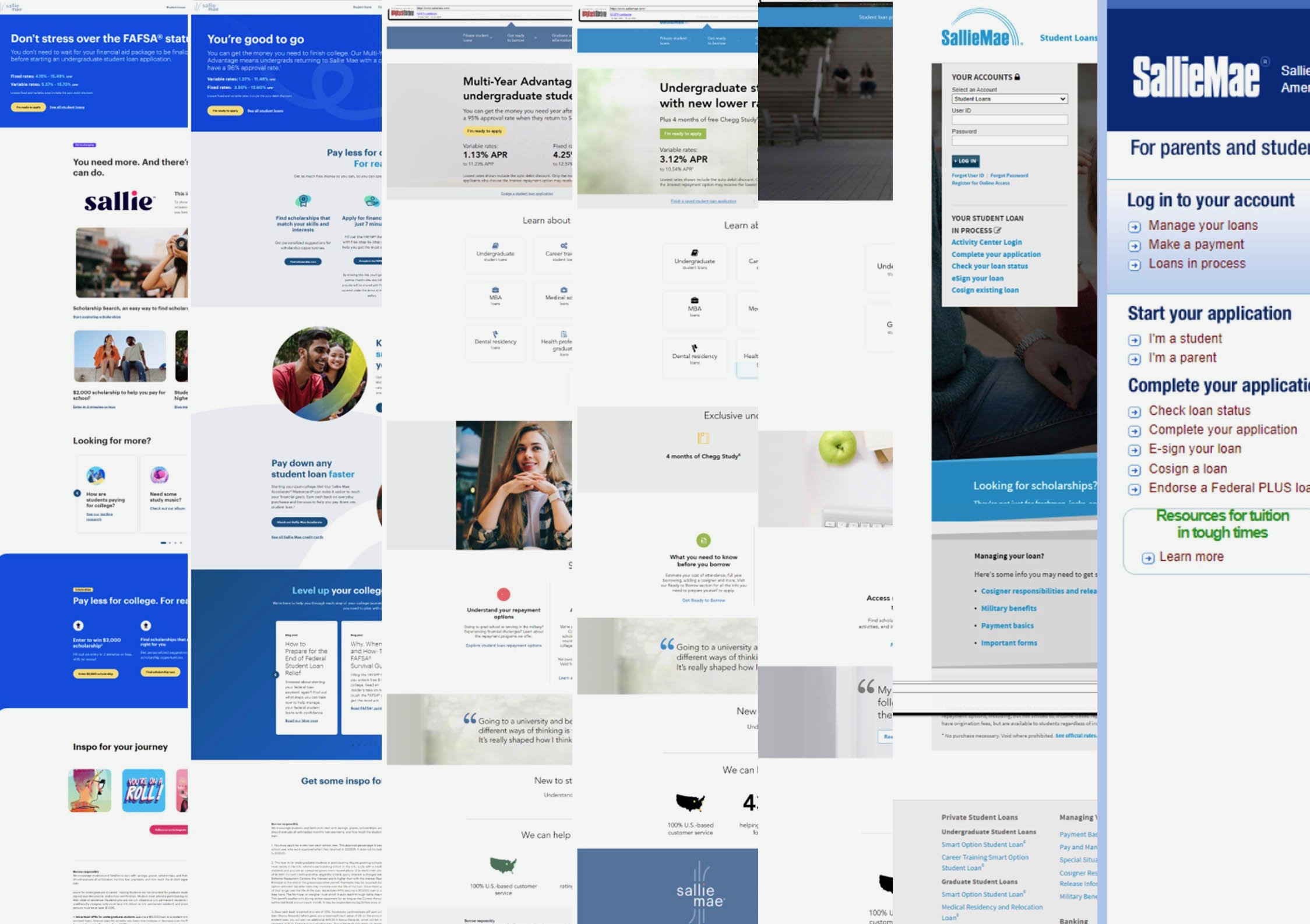
Legacy at Sallie. Prior to my arrival, the company had built up a lot of design debt.
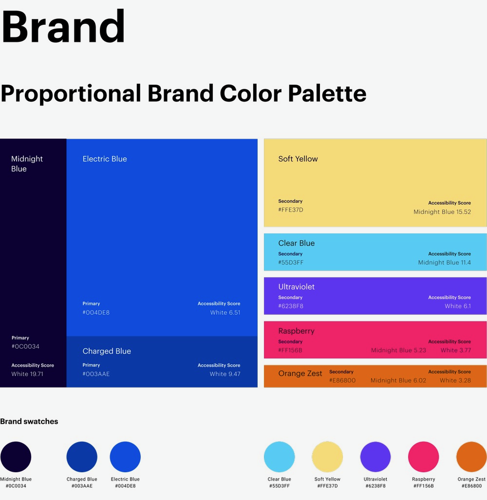
Brand Color Palette. Partnering heavily with the brand creative team, we crafted a new brand that would work across the entire ecosystem.

Brand Guidelines. Design really challenged the brand. The bold palette worked well in marketing but was poorly received by customers leading to this need.
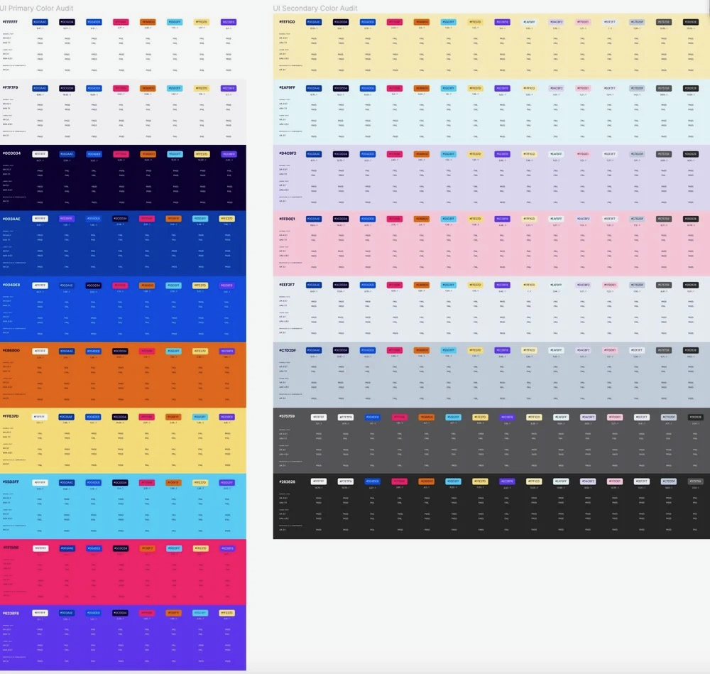
Accessibility Color Standards. Ensuring our core principle of 'inclusivity' was achieved, we thoroughly mapped out all permutations.
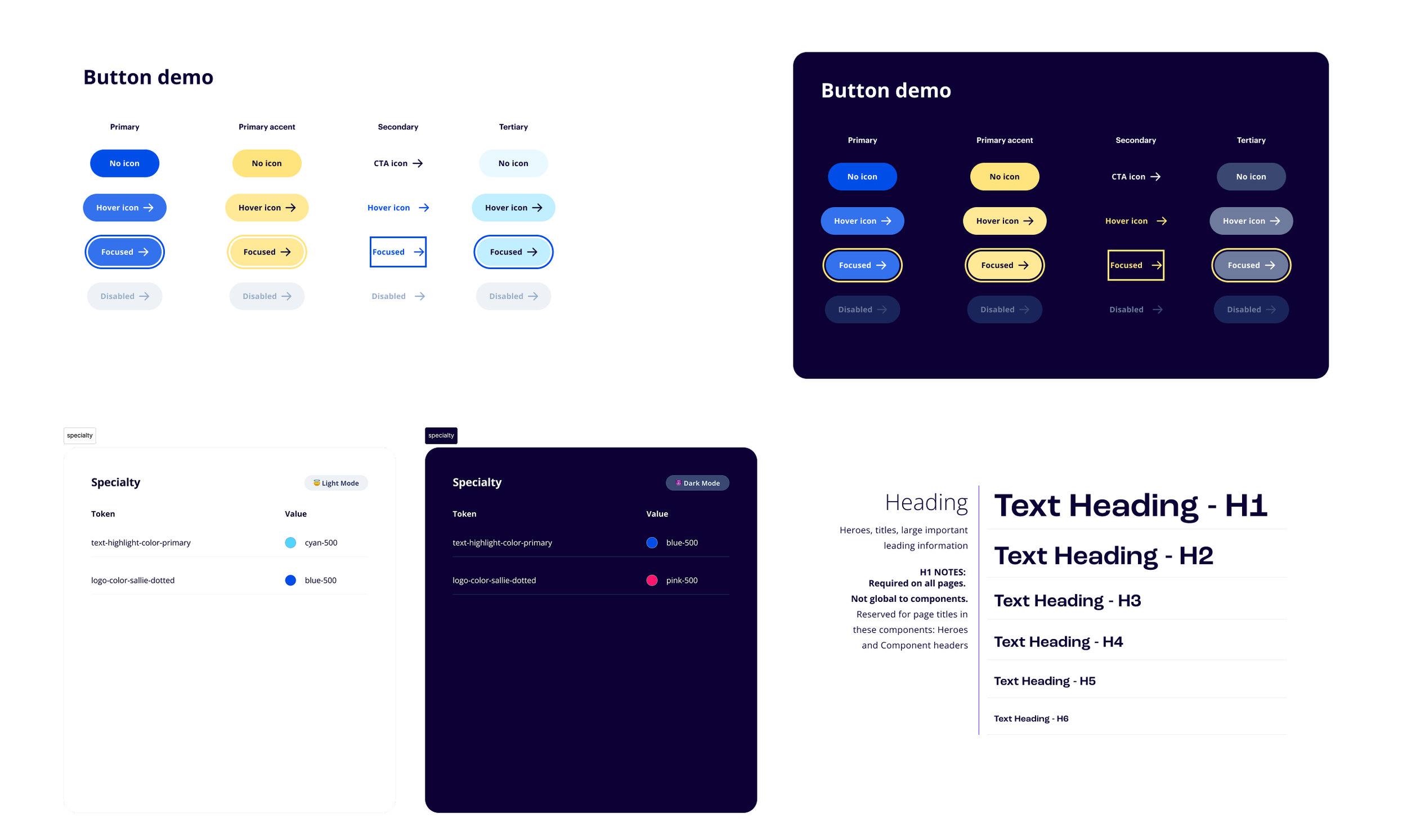
Button Demo. Getting design built is always harder than actually designing. We worked closely with developers to ensure we built scalability into requirements.
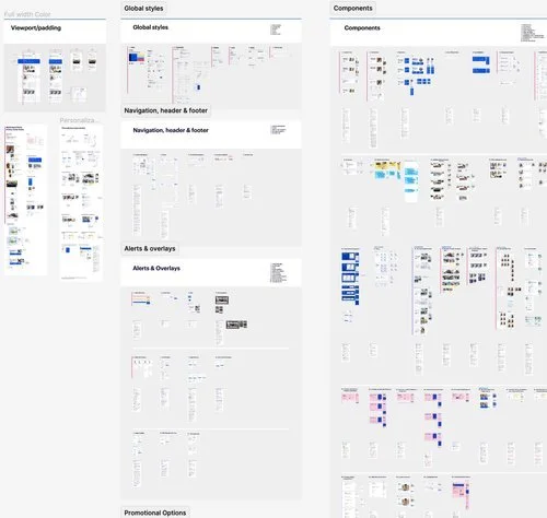
Design System. Affectionally called BKPK, it was a comprehensive library of components.
Homepage Concept. Taking a 'moonshot' into production.
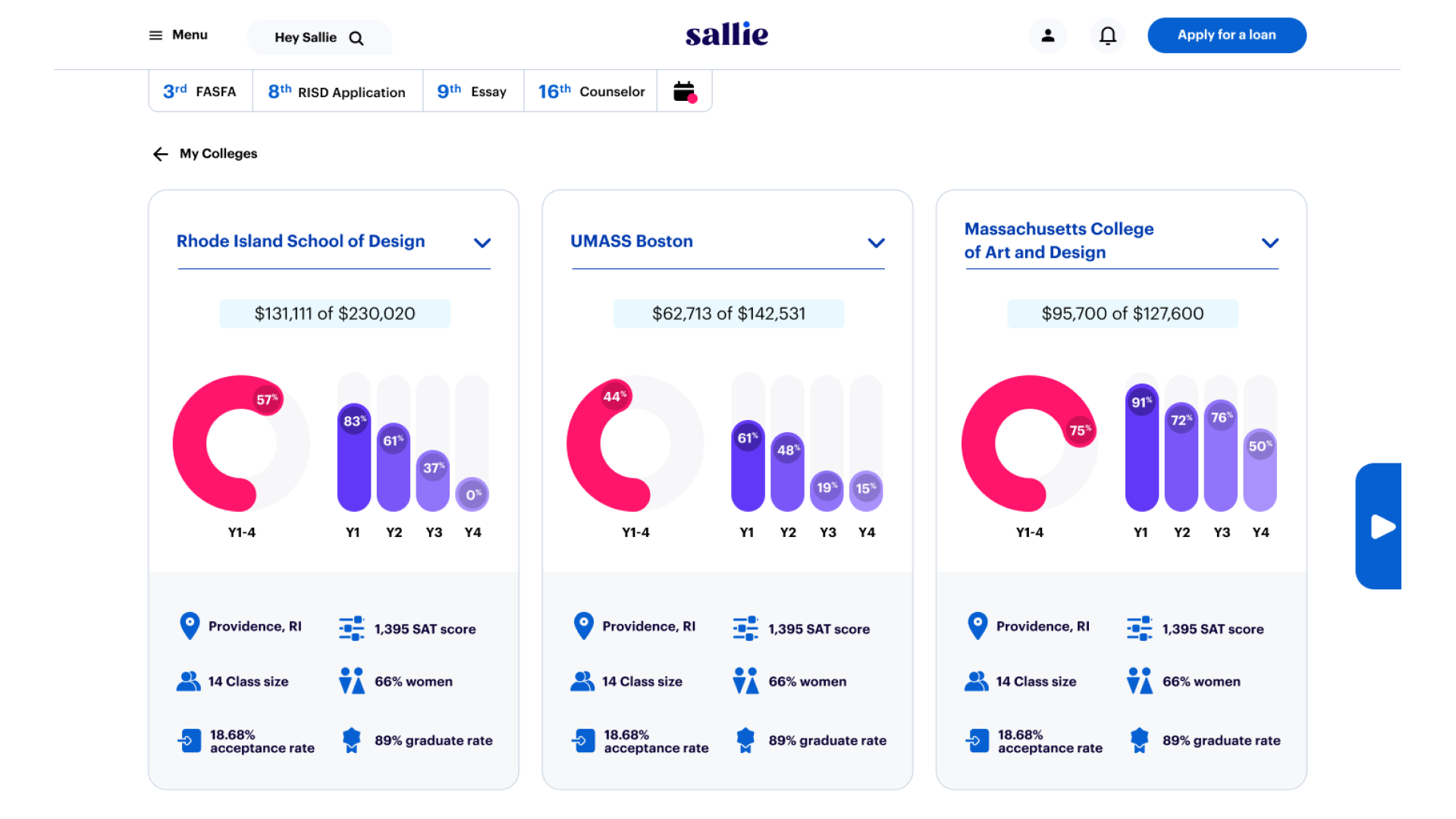
College Search Detail Page.
Prequalification Result Page. Addressing a key consumer insight that people wanted to shop by price, we developed a new tool to move earlier in the process.
College Search. A new edtech project launched to challenge US News & World Reports and help students find the best college for them.
College Search Comparison Concept. From our days with Nitro, we constantly pursued experiences that provided real value to young adults seeking higher education.
-
![]()
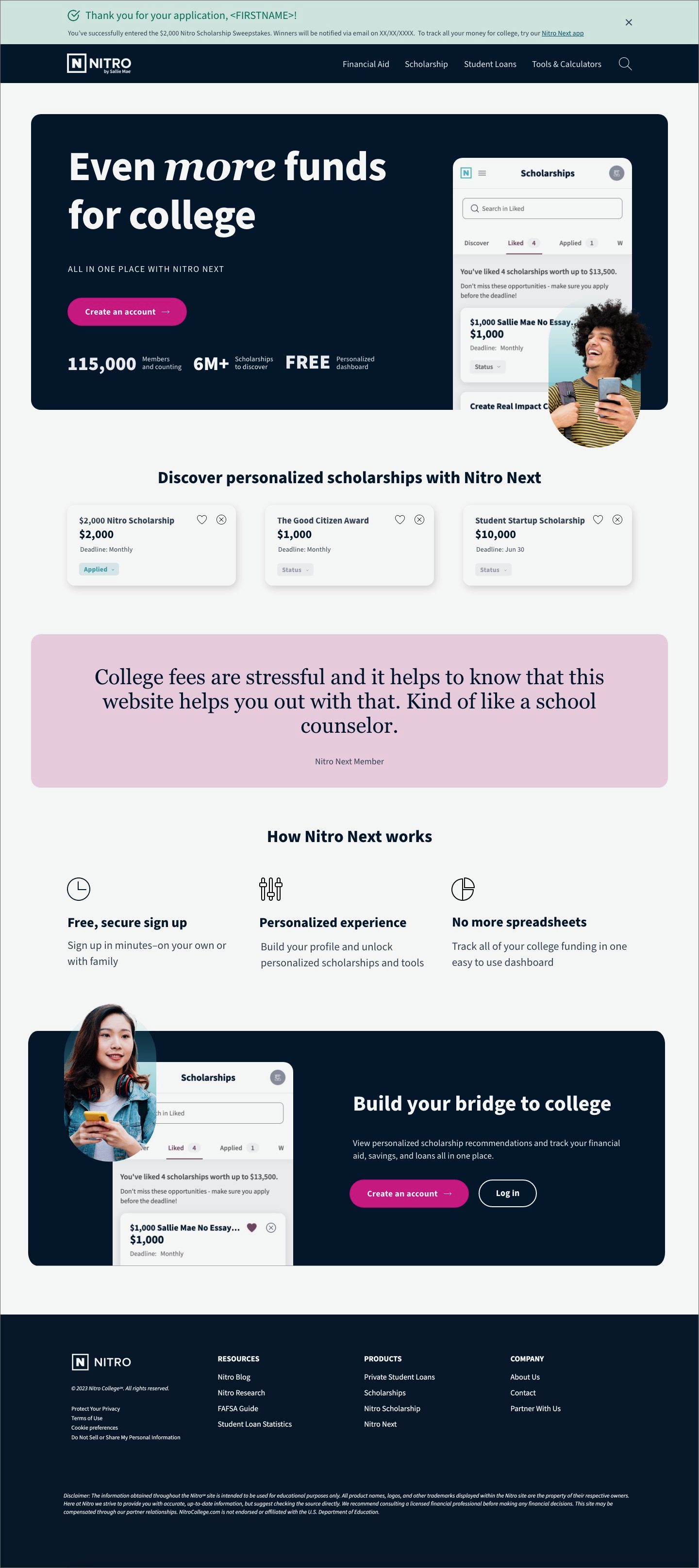
Nitro College
-
![]()
Application Experience
-
Design Systems
-
![]()
Front Door